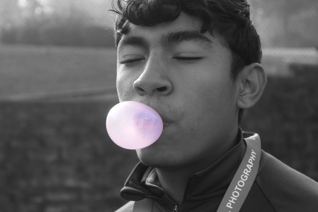
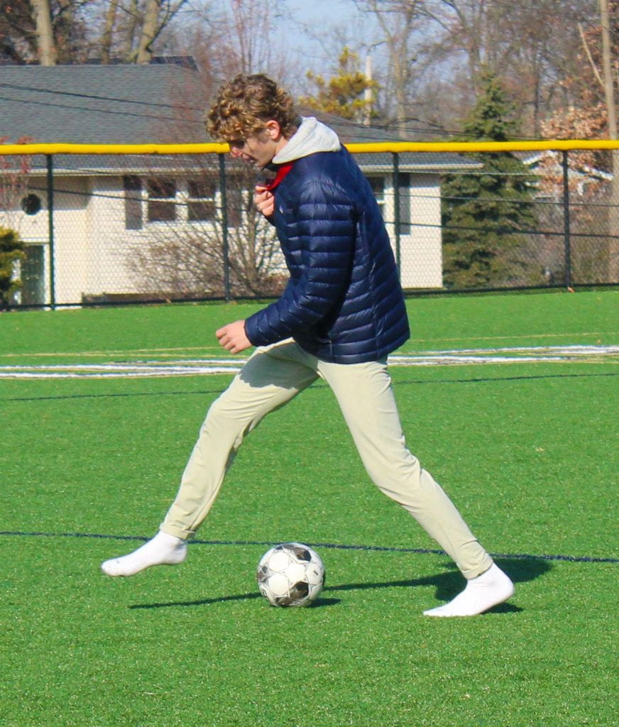
 Amir blowing bubblegum on the field.
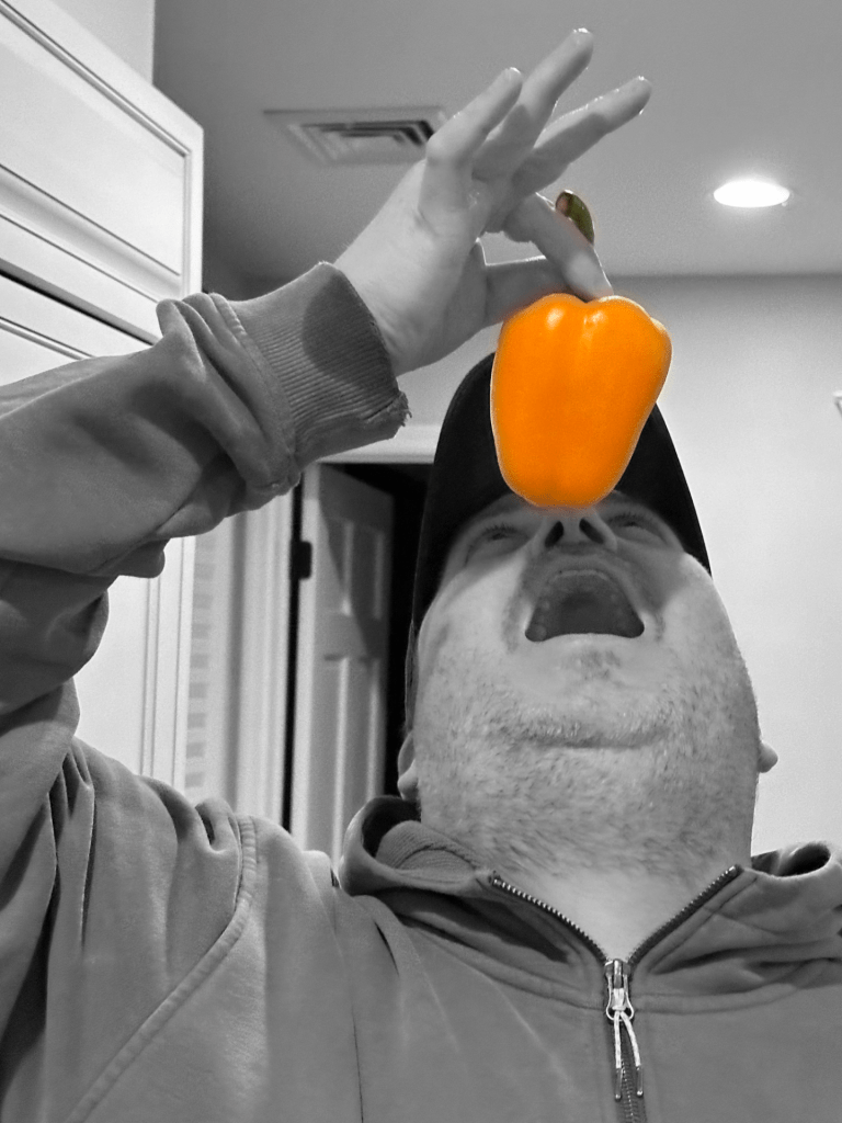 My Dad about to eat a pepper in my kitchen.
Q1 How did you choose the specific types of food for each portrait? What is their significance? Explain – be specific! (3 sentences min.)
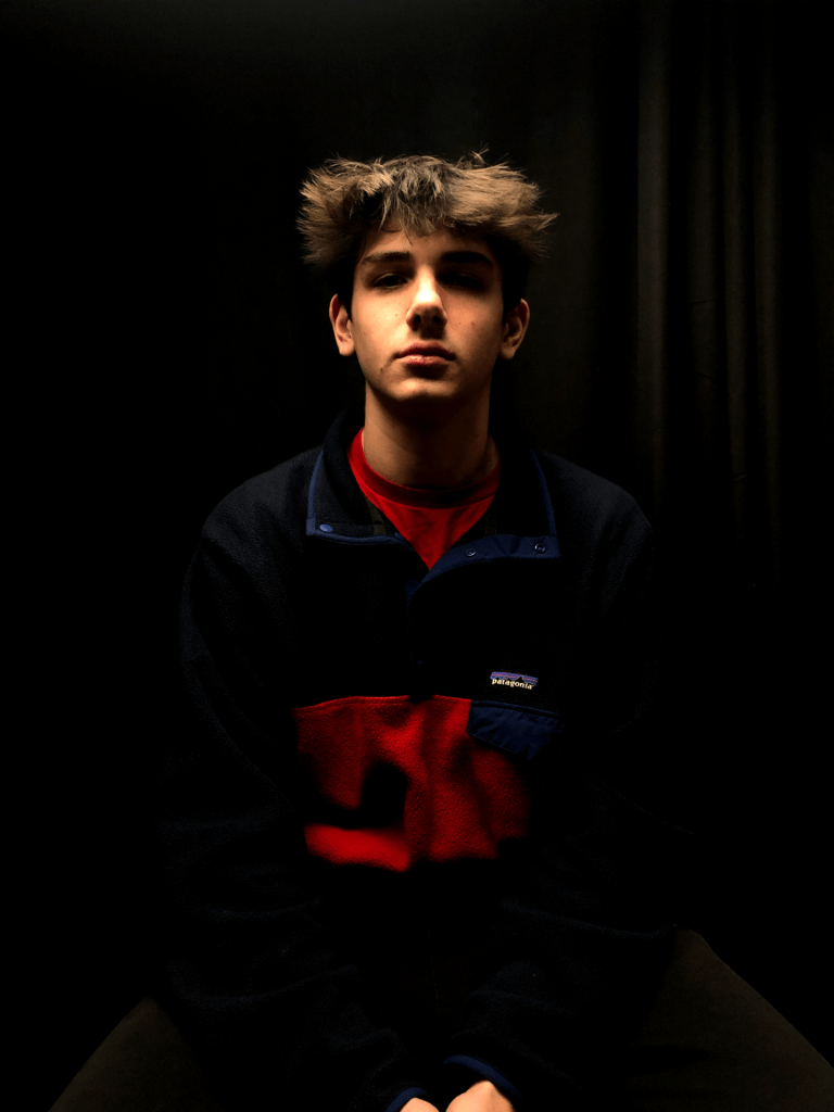
For the pepper, there wasn’t much significance in the food. We didn’t have much in our house and so we picked something from the fridge. As for the bubblegum, I was inspired by the photo of someone blowing gum from a past year and wanted to do something similar.
Q2 Consider the lighting in your photographs. What was the light source in each of your photos. What time of day? How did it affect the mood and atmosphere of the portraits? Explain – be specific! (3 sentences min.)
My pepper photo’s light source was the lights on the ceiling. It was also night time, so there wasn’t any light coming through the windows, which made the photo have a more bland mood and atmosphere. As for my gum picture, the light came from the sun which reflected off of the gum bubble adding a bright mood and cool atmosphere.
Q3 Think about the composition of your photos. Name the composition technique you used for each photo. Why did you choose to crop your photos as shown? Be specific! (3 sentences min.)
I used the fill the frame in my bubble gum photo and got close to my subject to emphasize the gum bubble. My pepper photo uses the rules of thirds composition technique. The pepper falls on one of the intersections which also helps emphasize it.
Q4 How do the colors and color splash technique in your photographs contribute to the overall impact of the images? Why did you choose to mask the specific areas in color for each photo? Be specific! (3 sentences min.)
The color splash technique is an effective way to emphasize something in a picture. In my photos, I masked the food to make it colored in contrast to the black and white background. It makes it extra easy to see what the people in the photos are eating!
Q5 Consider the technical aspects of your photography, such as focus, depth of field, and exposure. How did you use these techniques to enhance your images? Be specific! (3 sentences min.)
My depth of field in my photo of Amir was very small and helped emphasize his gum bubble. The exposure of light in my photo of Amir is high, allowing the reflection of light off his head and the bubble gum. The exposure is also high in my picture of my Dad, which makes the color of the pepper bright and vibrant.
Q6 What advice would you give to next year’s students for shooting food portraits? Be specific! (3 sentences min.)
I would say for people to pay attention to lighting and composition of their photos. On lighting, I would highly recommend taking all the photos outside because the reflection of light on objects always looks cool. Being attentive to the composition of photos is also important because it can make your photos more appealing to the eye.


 Refraction
 Shadows
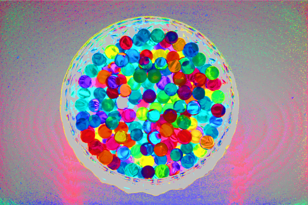 Water beads
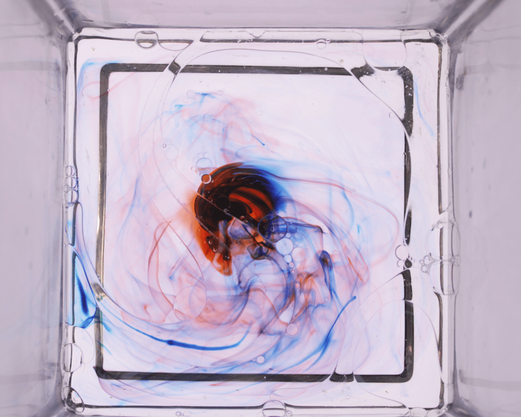 Oil & Water